Screen Printing
Equipment
A. Ink.
B. Squeegee.
C. Image.
D. Photo-emulsion.
E. Screen.
F. Printed image

Also known as silk-screening or serigraphy, screen printing involves using a tightly-stretched mesh or screen (hence the name!).
Either using a photo emulsion and exposing the screen to an inverted image on acetate or through blocking out parts of the screen using tape you create a form of stencil on the screen. A separate screen is required for each colour. When the screens or stencils are in place, the artist rolls, presses, sponges or as we will do, squeegees their ink or paint over the silkscreens to leave a design.
Where does the technique come from?
Silkscreens are believed to have originated in China as far back as 1000 years ago. The technique was introduced to Western Europe by Asia in the late 18th century, but was not widely used until silk mesh became easier to get hold of.
In the 20th century, Pop Art pioneers like Andy Warhol and James Francis Gill brought silkscreens to the forefront of contemporary art. Before this time, screenprinting techniques had been considered trade secrets and were kept confidential. Many regarded the art form with scepticism, as the reliance on a machine questioned the typical view of art creation as direct contact between the artist and medium. Today, it is an important technique that is used by artists all over the world.
Screen Printing Workshop 1


As an introduction to the process of screen printing we had a single screen each, we divided that screen into two section and created two simple designs, ideally with different dynamics, using just tape to block out the screen. The third image shows my screen, pre ink. I opted for a very uniform diagonal stripe for design 1, I used clear tape so it might not be terribly clear in the image. Design 2, I tried to create something more organic and random, by tearing the tape, varying scale, and placement was less organised.


I had varying success with this first workshop. The light pink didn't hold up against some of the bolder colours and got very lost. We didn't have a large amount of choice of colours for in this session, we had to make do with what was there, so I wouldn't have necessarily chosen the palette used.
I really enjoyed experimenting with blending the colour to get a gradient effect, I gave me an opportunity to work out the perfect amount of pulls until it blended well between each colour, but also find out when it was over done!
It was also a chance to see how the overprint technique worked, while the colours do blend It's not quite the same as mixing the ink together before hand. If the precision of the colour is important then using the knockout technique might be a better idea.
The image to the right was my most successful combination, both passes for each layer were good clean prints and I especially like the lower half where the pale pink tripe passes over the lilac and becomes a much more vivd pink.


Here is an example of how over print works, where the colour overlaps on the 2's and 0 you can see a combination of both colours, the end result will vary a little depending on which colour goes on top. As you can see while cyan and red paint mixed in a pot would be a lovely shade of purple (quantities of each dependant), however this is dark indigo. It gives a kind of shadow effect.
Screen Printing Workshop 2 - Penguin


In preparation for this workshop we coated our screens with photo-sensitive emulsion ahead of the class, allowing it time to dry. I also prepared my design in illustrator, separating out the components so I can apply different colours to them. On reflection I separated them out too much and created a lot more work for myself than I needed too. At the stage of design, I wasn't exactly clear on what i wanted to do so by having everything separate it gave me full control to colour as I needed to.

Screen 1

Screen 2

Screen 3
In preparation for this workshop we coated our screens with photo-sensitive emulsion ahead of the class, allowing it time to dry. I also prepared my design in illustrator, separating out the components so I can apply different colours to them, giving me the option as to whether I wanted to use the overlay or knockout technique in certain areas. On reflection I separated them out too much and created a lot more work for myself than I needed too. At the stage of design, I wasn't exactly clear on what i wanted to do so by having everything separate it gave me full control to colour as I needed to.
If I were to do this again though I would have combine the penguin outer and the oval outline (screen 2) as one and I would have decided on one of the base ovals (screen 1), I did not need both. Finally, I would have broken up the text so it wasn't all on the same screen, to speed up applying it to the posters.
The other thing I would do differently if to repeat this exercise is that I would have made definitive choices about colours and not had so many variables. Easy to say in hindsight once i have seen the outcomes of some of the decisions that didn't work, things i could have only found out by trying. However, by have such a vast range of options meant I lacked focus and rather than repeating the same colour selection for 4 or 5 prints, giving an option to pick the best I have a large selection of tests and very little choice on a final print.


Screen Printing - Further Development
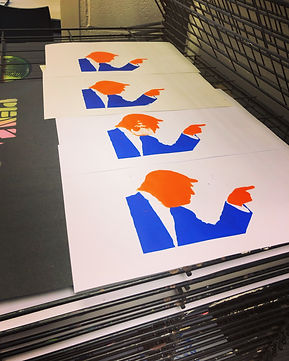
While we were covering screen printing in our Techniques & Processes workshops, we were also doing a project on '50 Things'. My subject matter was Strawberry and Orange, and I was developing a narrative with Trump and a Strawberry. I felt that screen print would be the perfect medium to explore this further.
As part of the preparation process on the imagery used in screen printing can be to add a half tone effect on any areas of flat colour to make it look as if many more levels of grey are visible in the print by laying down ink in some areas and not in others, and using such a small pattern of dots that the individual dots cannot be seen at normal viewing distance this also allows other colour show through if layered up.
With my trump images I feel I made the half tone pattern too dense, with not enough 'air' in the areas of shadow. If i was to do again I would lighten these up. I would also have used the black as a base as it was overpowering as a detail layer and for all the prints I did with colour first they lost much of the 'drama' the colour provided.


As a result of this I got a fabulous variety of outcomes, however, none were what I had imagined. But I was eager to get something on my Insta feed for the project, and I had no pre time to do anymore. So, while in a waiting room, I experimented with Photoshop on my phone. Digitally combining a colour only print with one of the black mis-prints. Because of the interesting texture where the ink didn't come through correctly, I feel, has made the best image of all. Even with the warped perspective of the colour layer being a photograph (at a slight angle, not directly face on) and the black being scanned in, so completely flat, meaning that they layers were misaligned, for me this added to a Warhol-esque imperfect feel.
By combining the organic mistakes, unintended inks that leaked through holes from the eroding emulsion in the white areas, along with the digital control of Photoshop, allowing precision of opacity and the saturation of colour, has resulted in my favourite image. But I do feel this has also given me the experience to be able to get a little closer to being able to achieve my outcome without the aid a digital touch up at the end next time.


