WhatsApp Animated Sticker Project
What do you + yours say in Whatsapp?
Identify + list 12 MESSAGES/SENTIMENTS/IMAGES
One thing I have noticed while scrolling through my message to identify common themes is that i'm one for conveying my thoughts and feelings visually rather than verbally, it's much quicker, a kind of shorthand and more succinct than language. This is mainly through emojis and the odd meme, but stickers had fallen off the radar.
General sentiments exchanged between me and my mum friends:
-
Arghh the kids are licking the windows!
-
Arghh the dog ate a packet of water balloons and is now pooping colourful latex poops!
-
Arghh my husband just stepped over the washing on the stairs that was clear meant to go up!
-
Don't worry babe things are meant to be this difficult and you're totally bossing it!
General sentiments exchanged between me and partner:
-
Will you pick up a cheeky dessert on your way back please?
-
I am at X skate park continuing my midlife crisis.
-
Child 2 is still not asleep!!!
-
Photograph of Child 1's prolific art production.
Emojis;
-
Heart
-
Head in hand
-
Care icon on facebook - much needed in other messaging
-
LOL
-
Thumbs up
-
Crossed fingers
Sticker Research
Looking at WhatsApp sticker packs...

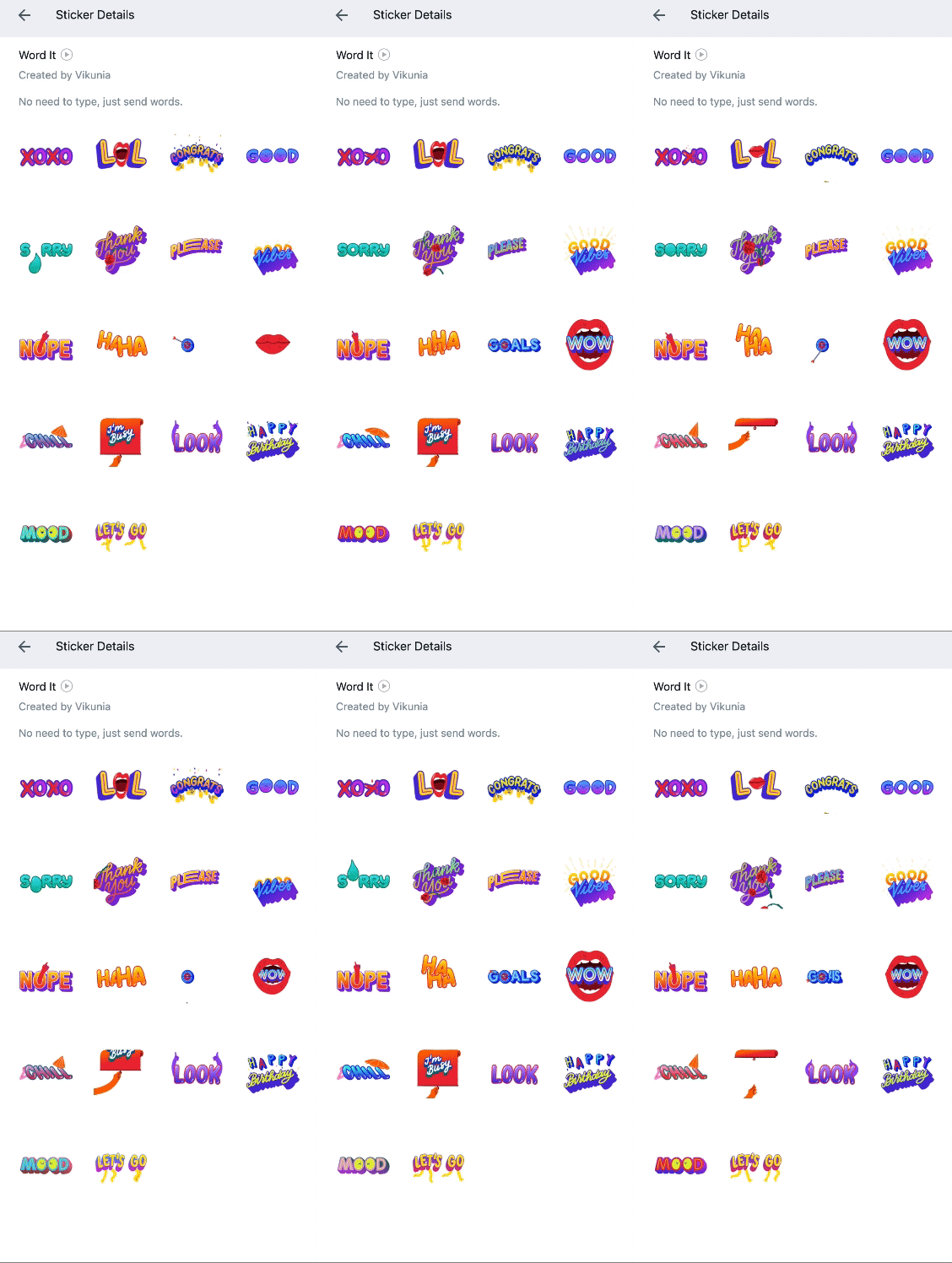
Animated text and expressive type.
Looking specifically at Word It by Vikunia, this pack
covered many of the sentiments I had identified in the exercise above.
These are bright, fun and happy stickers, 2D in design, could be a little intricate to be clear if small. Many of the stickers employ the 'squash and squeeze' principle, 'Sorry' and 'XOXO' being the best examples. The timing on 'Im busy' creates just a moment of anticipation. Albeit very subtle 'Thanks you', 'Chill' and 'Wow' have secondary actions happening, which adds more dimension to them.
Wide audience appeal relevant to aspects of most peoples lives, but limited by individuals use of language and text speak.
Obscure and quirky.
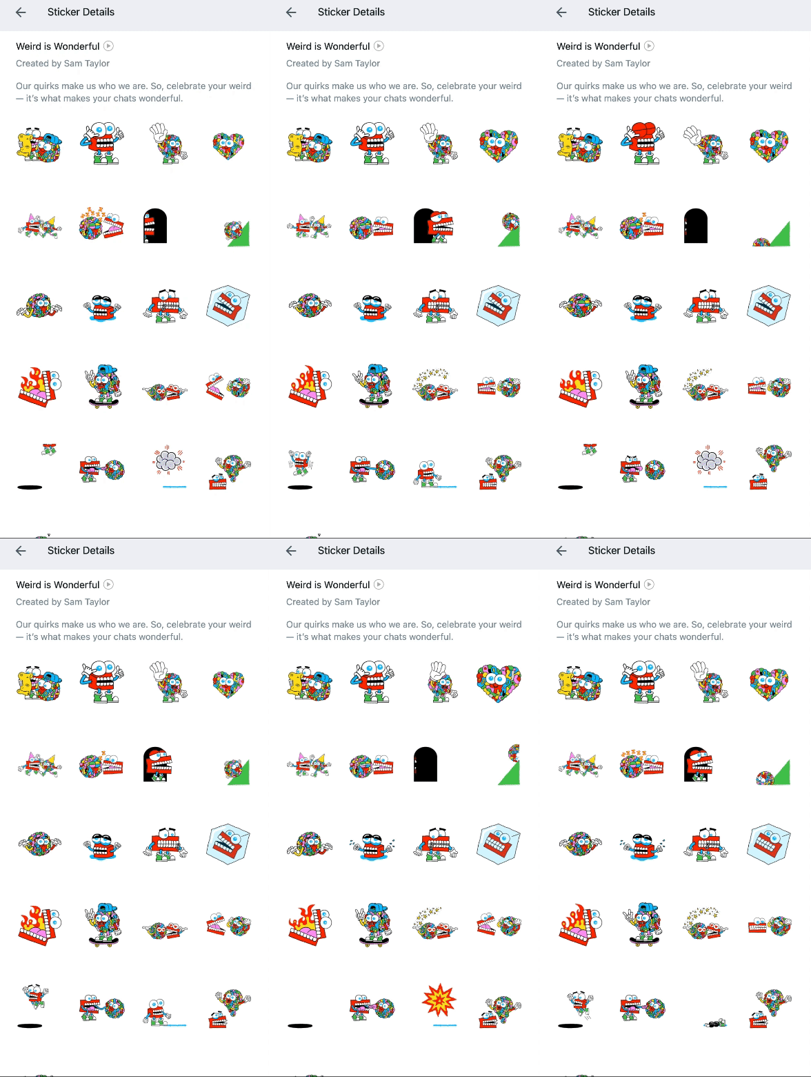
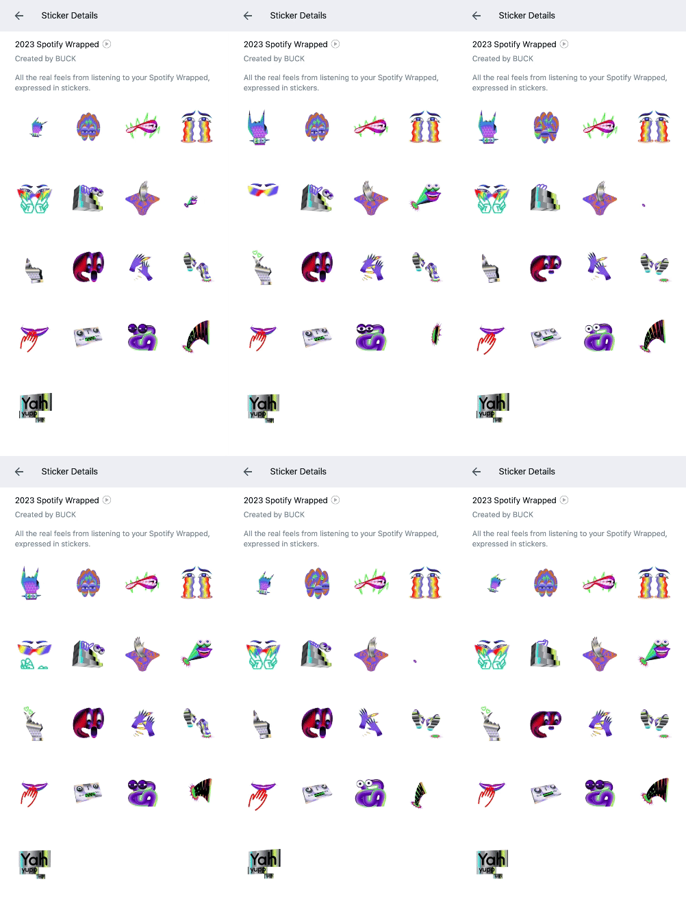
Both of these packs appealed to me, their wackiness makes them compelling to engage with. Spotify Wrapped has a very surreal approach, using smooth motions and a colour palette that is very much 'of the moment' as it is designed to represent 2023. Primary target audience Spotify users, but its contemporary palette could draw in GenZ and psychedelic imagery appealing to Baby boomers.
The Weird is wonderful character has more of a cute oddball appeal, the actions appear quite jerky, the addition of Easing would help with this, it also lookalike they have been created pose to pose with no frames in-between. Many elements here are exaggerated to convey really clearly the intended action. Audience appeal perhaps more male demographic, Millennial and GenX due to some of the activities, but both en-gendered characters.
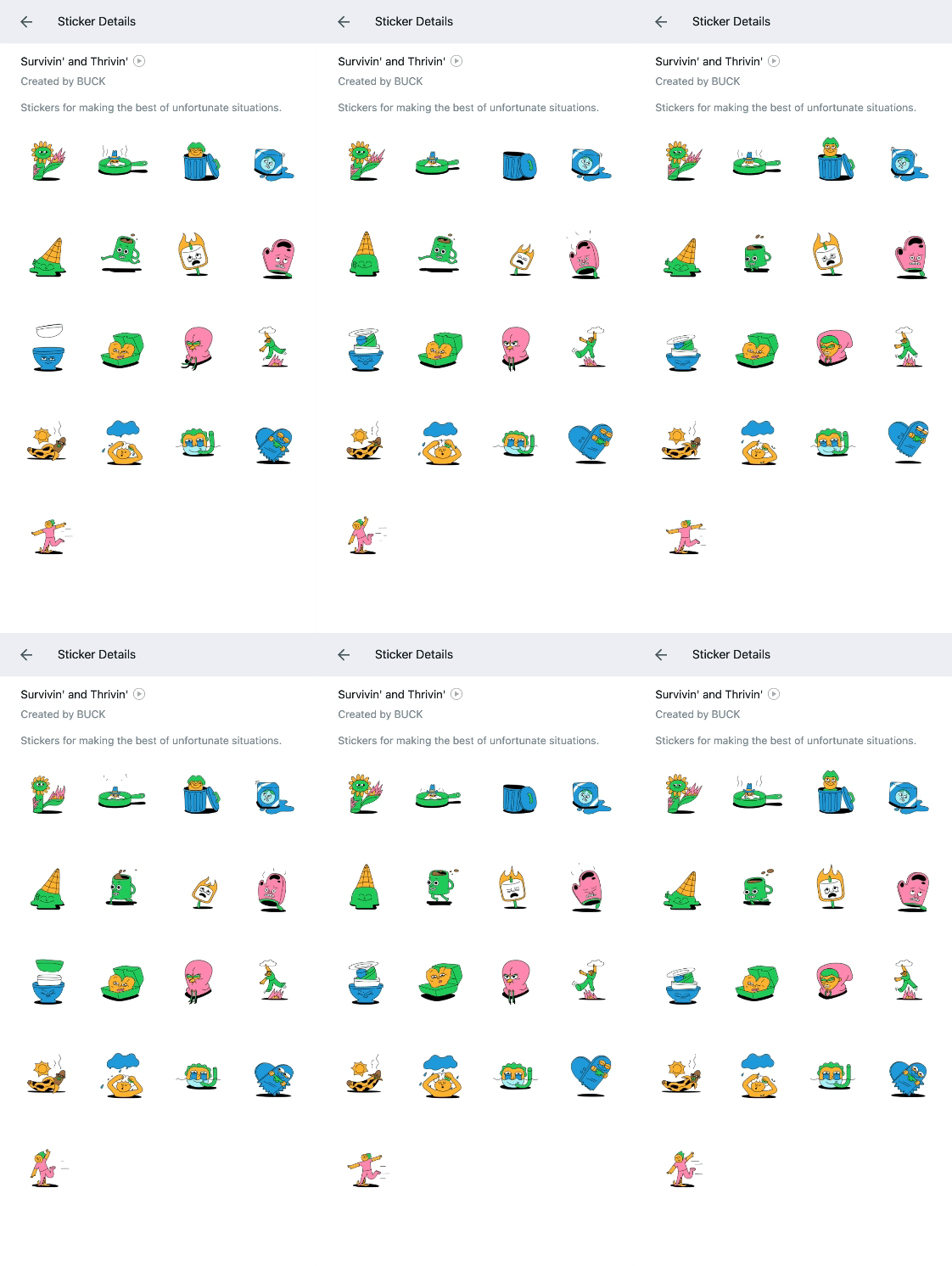
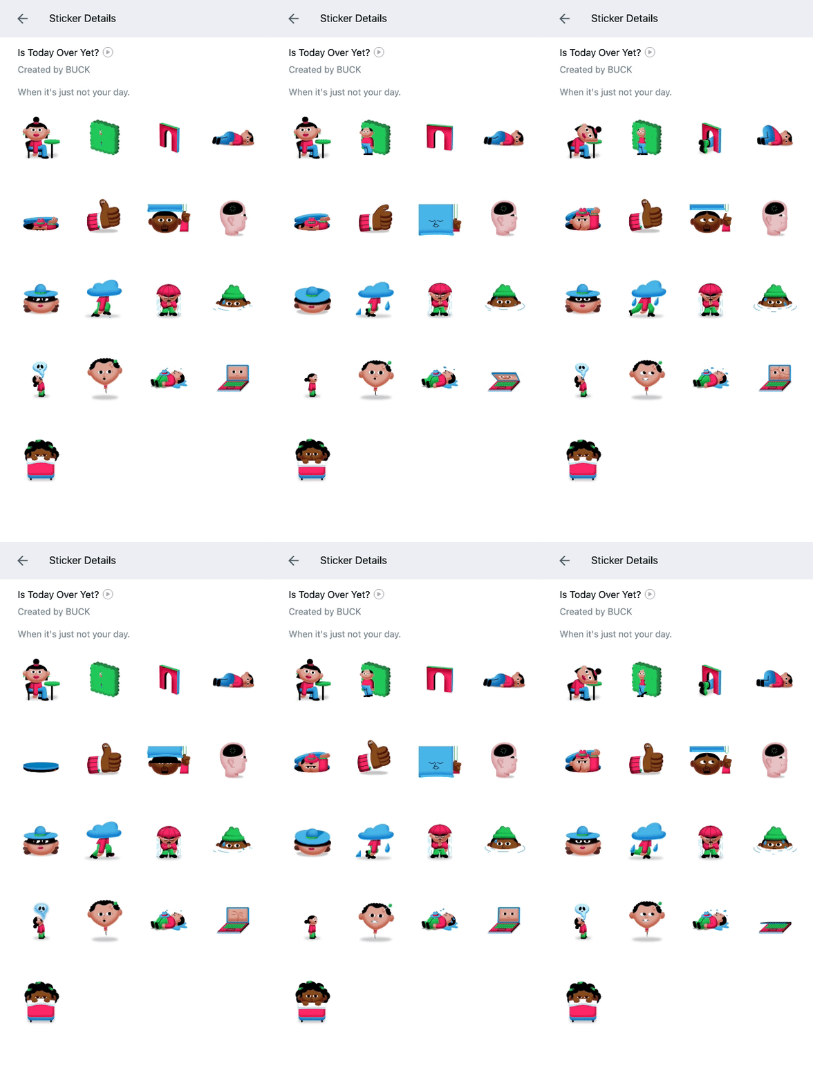
It's all gone wrong!
These two packs use humour to convey moments that aren't going to plan. Both are created by Buck and have a similar feel and colour palette but slightly different illustration style. I can see examples of Follow through and overlapping actions in the two sets; As the the lady at the beginning of set 2 drops her head to the table her arms and legs keep moving momentarily and hood lady in set 1 pulls hood tight in her drawstrings are still in motion at the end.
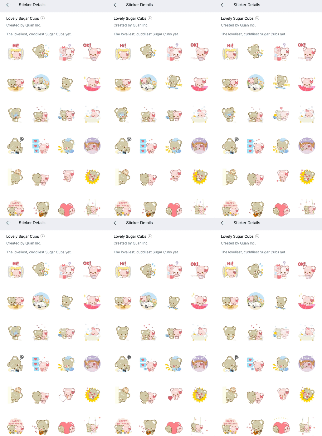
Far too cute.
Large oversized heads and exaggerated eyes give the characters appeal, appearing more childlike and innocent. These types of sticker packs epitomised my expectation of digital stickers prior to this research, which is why i'd been avoiding them. The saccharin naivety may appeal more to children though.
Clear use of Easing on Ok pancake flip. Staging for all stickers tends to be limited in what can be achieved in the small space but for the car and bed sticker they are given a backdrop of scenery, framed in a circle to create continuity.
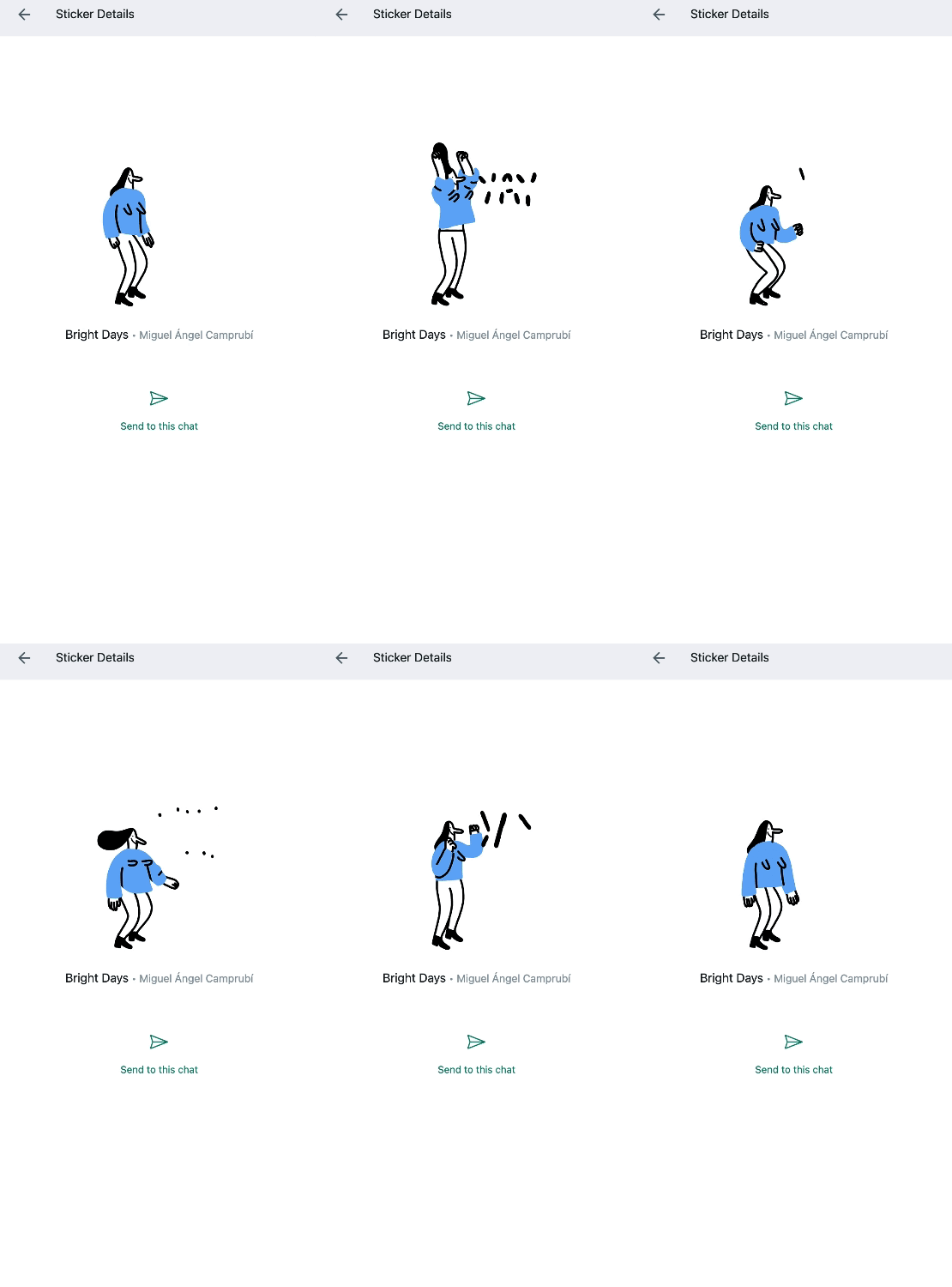
Worth a special mention.
Bright Days jumping women, this has to be mentioned. The secondary action within this really made me giggle, appealing to me as woman, it's fun, simple and effectively timed easing for a realistic movement. Minimal but every aspect of the animation is doing something.
My Ideas
Identify areas to explore...
We looked at ways of generating ideas, and considered areas that appealed to us or filled a gap.


Instagram Personality and comedian - Anna Przy
After exploring a range of ideas ('The Hokey Cokey', 'Hugs', 'Not my circus, Not my Monkey'), I settled on Using the Instagram account @akprzy to inspire my stickers. The USP of Anna's posts is her shouting affirmations at the viewer, aimed mainly at women in their 30's-50's, while performing completely futile tasks such as hoovering the snow or brushing a tree, to emphasise the ridiculous pressure we put ourselves under. I watched a bunch of her posts and noted down catchy or regularly repeated phrases she uses. I then narrowed those down, considering if they would be visually captivating sticker ideas and more importantly achievable with my skill set and time frame.


STICKER PACK TREATMENT:
Synopsis
What is the content and structure of the pack?
12 bright, playful stickers. 6 animated and 6 static. Combination of text and visuals based on inspirational but humorous quotes from Anna Przy’s Instagram posts. These are intended to be fun and offbeat.
Medium & Style
Gifs - Motion Graphics, Bright and varied colour palette. I don’t have an illustration style so simple and flat, no [black] outlines. Font - casual/bubble/ essence of 70’s cartoon writing, somewhat nostalgic but not all the way to retro.
Characters
The characters are illustrations of the words, and potentially inanimate objects, unified and anthropomorphised but the same pair of eyes. They are endearing because they’re existence is futile.
Visual Elements:
The content is all flat – face on imagery, no humans – mostly typography, with a few personified objects. Minimal, no scenery.
Theme, tone, genre:
Fun, offbeat, playful, and humous. Underpinned by uplifting and inspirational sentiments.
Target Audience & Rationale:
The audience will ultimately be Anna’s audience. This appears (from a cursory glance over user demographic to be mainly white women, predominantly ‘moms’)
The appeal will be a buy in to her take on the world.
References
https://www.instagram.com/reel/C5yNEOKqCJ1/?igsh=aDEzeXprZG9zcTA0
This is the sentiment I wish to capture.
Mood Boards
Collecting and compiling visual inspiration.

Storyboards
I found this part a challenge, I have found the whole project has stretched me out of my comfort zone, however, this was difficult because I don't have much confidence/skill for drawing, so I feel uncomfortable producing aesthetically substandard (in my opinion) work. I have addressed this by attending life drawing classes, to help improve my skills but also making marks under pressure in quick fire poses.
I also found it hard as the content was so short it made some of the stickers hard to demonstrate - but it was a very useful task as it highlighted potential pitfalls really quickly without getting to far down one road, it also meant I could explore many options without expending too much time.

Animatics
The goal of an animatic is to define the timing for a piece of moving image. They set the pace.
However, as with the storyboards, because the animations were so short, the animatics didn't serve quite the same function as in a longer production. In fact, the animatics for my animated images ended up becoming the animation. This worked well in this situation but isn't how it is meant to be.

Style frames
I had a clear idea for the text I wanted to produce, however I wasn't as clear about the images and more importantly how I was going to make them aesthetically cohesive. The style frames not only helped me works through the individual aspects, working out what worked best but very importantly It helped me drawn them all together as a group. Things like colour palette, outline stroke weight and the same style eyes for the anthropomorphised objects all fed into unifying the group. I also opted for no black lines and flat as possible images. The pasta to me does look a little out of place as it is more 3D then the other objects, but I found it really difficult to convey what it was without that, but the eyes did a good job of distracting from that.


Final stickers
So I reached the end with a set of 12 stickers, something I wasn't sure I could do. Not only that but I am pretty pleased with the result. They are by no means perfect though. Only a quarter of them were created in After Effects, originally intended to create everything, and those that were had a clunky transition from .mov files into gifs. The rest were a combination of Illustrator pngs and Photoshop compiling the image sequences as gifs. Once in .gif format, I then used the Sticker Maker app from Tamara Vardanyan to convert them into a sticker pack and import them to WhatsApp.
I noticed there were colour discrepancies in some places, I'm not sure if that was due to the difference processes I used, as the colour bit-depth varies depending on working file formats.


For the 'tray icon' I chose 'Sometimes brains just don't brain' as this sentiment summed up the pack the best, It was also the favourite colour scheme (for me and the users tested). However, in retrospect it is too small to read and the colours are mostly lost, so perhaps the eyes might be clearest as a small scale. The heart would also work but i feel this is far too generic to represent the set.
A few things I would have liked to have changed having more time:
1. This would be the angled colour change on 'Put that guilt in the bin' it didn't work as well as the flash to next colour in one go, I think it is too subtle and gets lost in the group, but also it just looks odd - maybe if the guilt was alone in the middle and the in moved to the bottom row. I'd had a similar issue with the 'Pastabilites' text looking like a shine, but i managed to change that. `
2. The eyes would have more frames awake after the pop before closing again, to enhance the idea that they are awake.
3. The hurumphing brain's arms need to go up almost immediately, I haven't quite got the action appearing as I intended yet, I think it needs more frames in general for a smoother quality, the squash as he gets to the bottom of his fall could do with a few more squashes to make it less obvious. Watched on the phone at the size if a sticker it's not nearly as noticeable as it is close up and the message comes across well enough.
The 'Keep it up Cutie' sticker also wasn't as I intended, i'd tried a few different things with the lightening strike, I hadn't finished, Intending a most naturalistic lightening but when i saw it on the black background, at the pace it came out on the phone and small, it looked great.
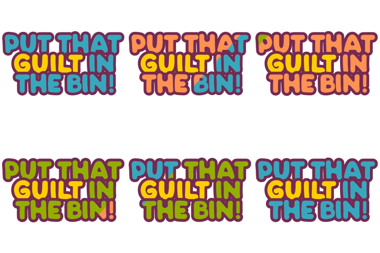
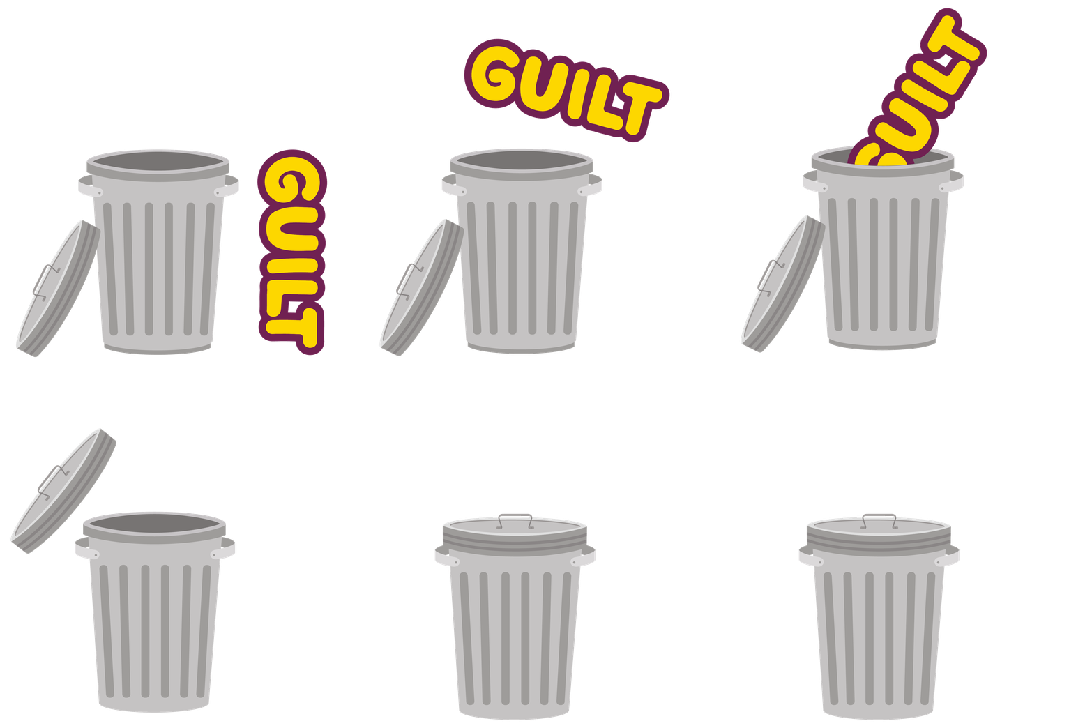
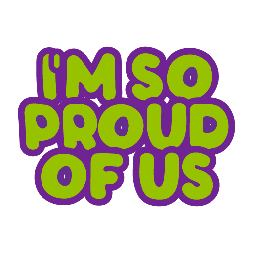
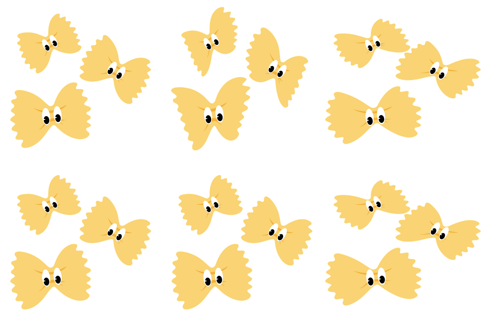
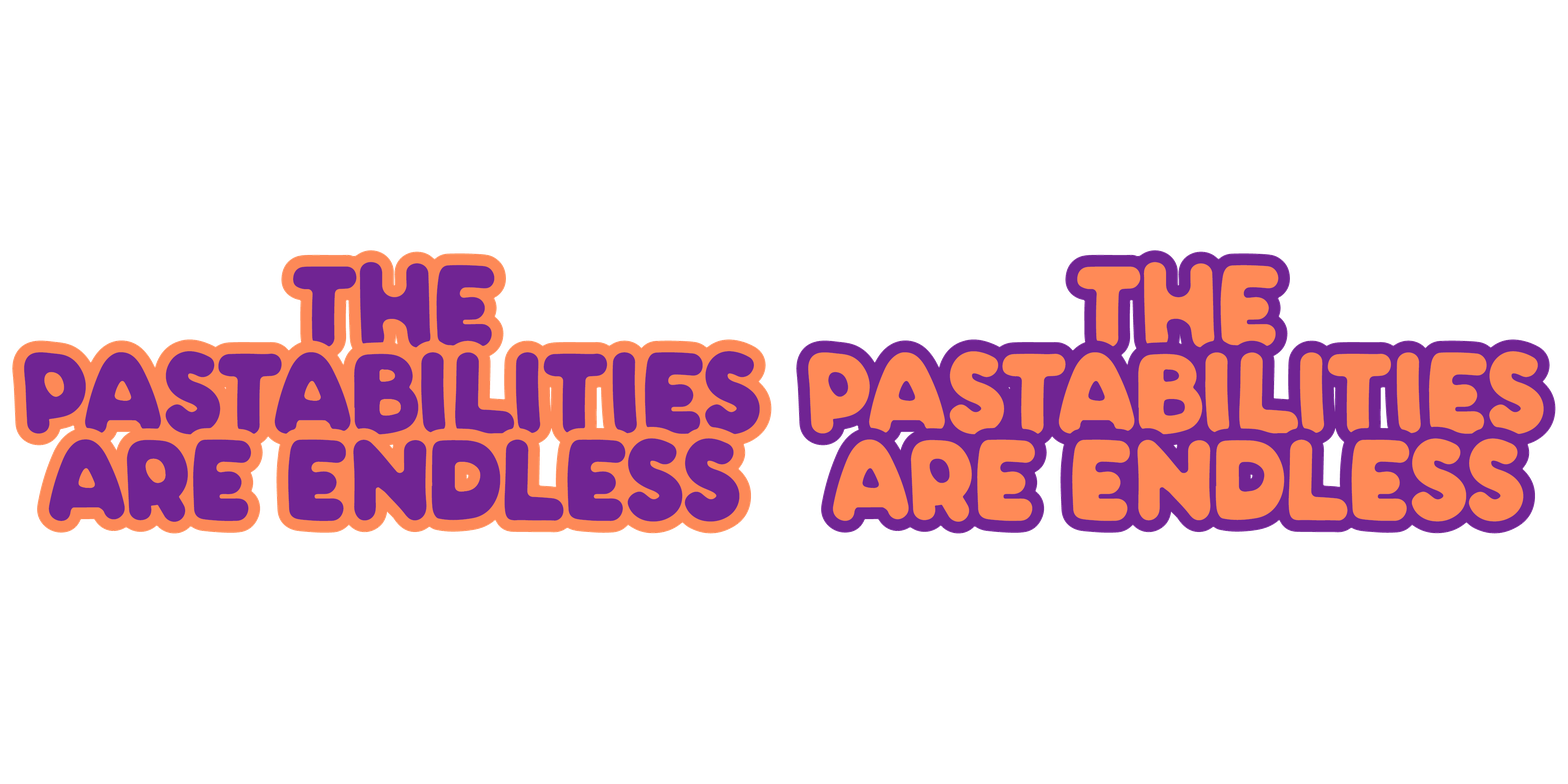
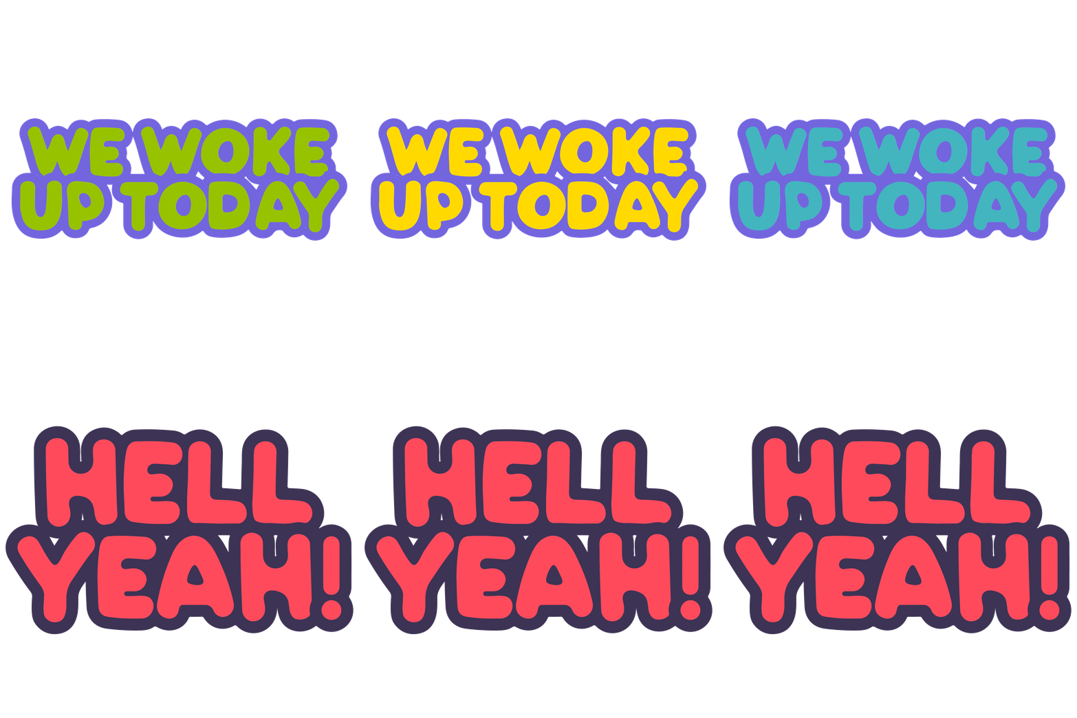
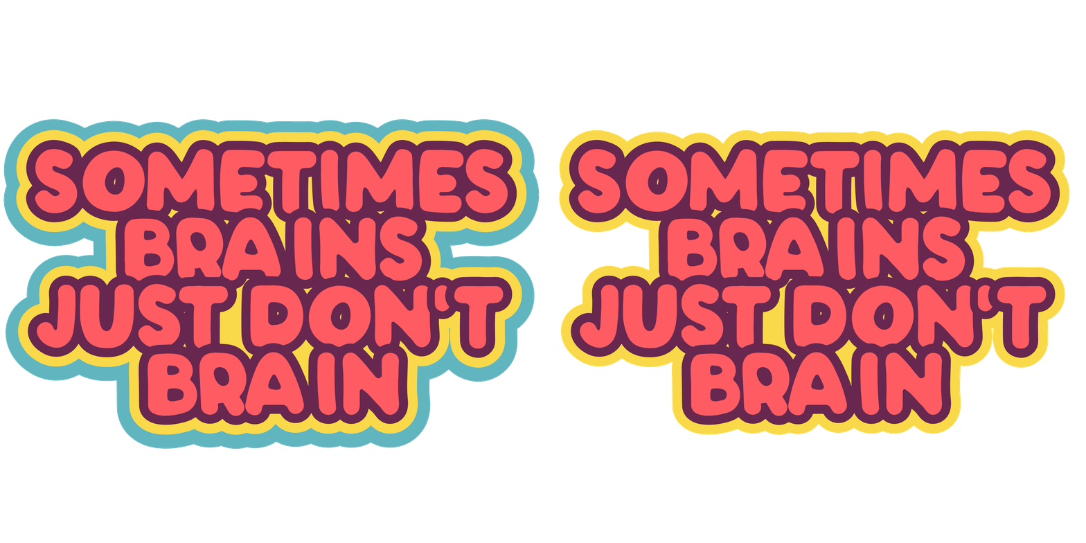
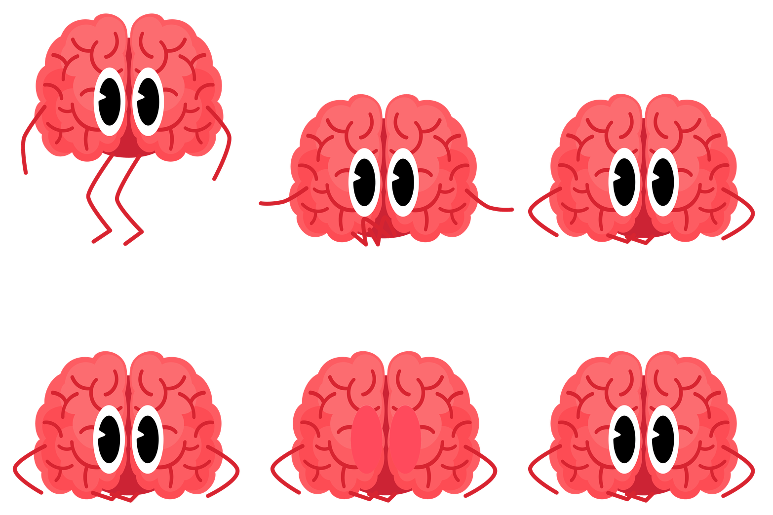
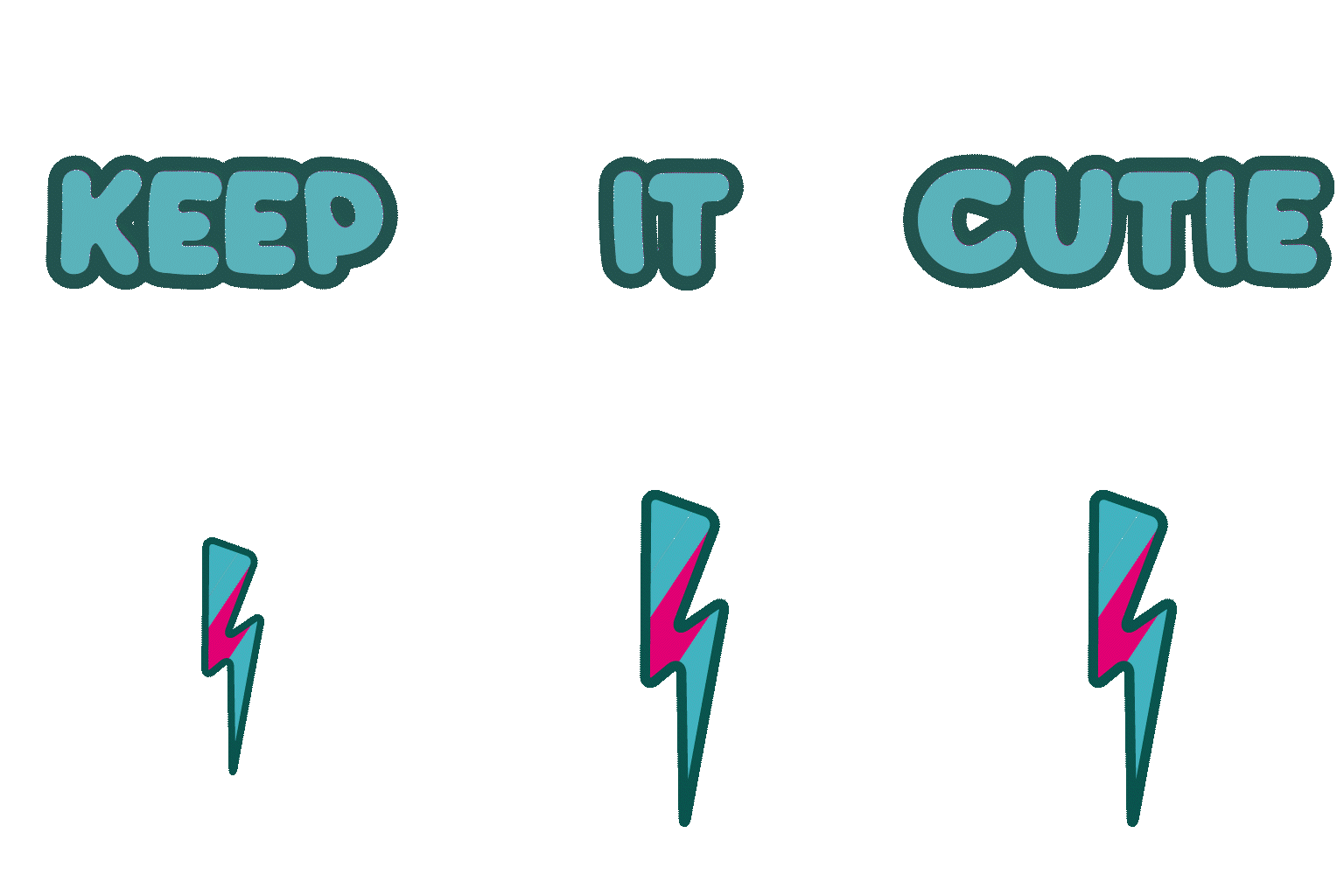

This set was created specifically for the audience of Anna Przy, as it directly links to her content. Her appeal is predominantly to women roughly 30 years to 50/60 years old. Her audience are people that are overwhelmed by life, I feel she is essentially talking to herself but the appeal is universal, she does not mention specific things like kids, religion, politics or race making her accessible to all. I feel similarly, my stickers do the same, the pasta is a bit left field without the context of that video, but the intent is to be quirky. Like Anna my stickers are fun, bold and brash, but kind hearted. The the rounded text, looks hand written and has a feel feel of comic books for kids, making it easy to engage with along with the supportive sentiments they convey. It feels inclusive and warm.
Taking it forward, there are so many fantastic sound bites from Anna's instagram I had content for at least double the set - just not the time! I'd really like to add 'It's called manifesting - look it up' and an image to compliment it, I struggled to think of something at the idea generation stage though as she is lying in snow, a strong visual but hard to convey in keeping with my set.
Feedback from User Testing
Users were questioned conversationally, after having been sent/seen the stickers in WhatsApp. They were asked about the relevance to them, the cohesiveness of the set, favourite and least favourite stickers and why, would they make any changes, then any other thoughts. None of the users were familiar with Anna Przy.
User 1
Female | Mid 40's | Asian Australian | University Educated
-
Liked font continuity.
-
Guilt in the Bin text needs complimentary colours to make it pop more.
-
Asked if Anna was American, on yes User felt that emphasis in 'I'm so proud of us' should be on SO and US and needs '!' at the end.
-
Loves the Guilt in the bin visual because she loves the literal illustration.
-
I should emphasise PASTA in pastabilities
-
Flagged typos which I was able to correct.
User 2
Female | Mid 30's | White British | University Educated
-
First of all, I love these stickers 😍
-
Can definitely see the inspiration quote-wise. The colours are so great - really nostalgic (yet current?!) + upbeat & fun.
-
I particularly the two brain stickers. I would use these everyday & I wish they were available as Slack emoji.
-
Visually, they're clearly all part of the same collection (in my opinion), which I'd categorise as Motivational.
-
No change or improvement that I can think of 🧐
User 3
Male | Mid 40's | White British | University Educated
-
Felt that the set, at least in part was relevant to him and could see situations he would use the stickers in (if he used stickers - because "he's not a 15 year old girl").
-
Type is clearly part of the same set, viewed altogether it is clearer they are cohesive. The font is the strongest linking factor. Colour palette possibly too many colours.
-
Brain and Bestie text works the best visually, especially Bestie because it's the only one utilising scale hierarchy.
-
Would a white outline make them look better?
-
Proud should be more prominent? In front of other text. [changed his mind and agreed with User 1]
-
Favourite - Guilt in the Bin because animated rather than stated the sentiment.
-
Least favourite - Pasta text because animation was confusing looked 3D when others looked flat [Was shown before I removed the 'shine' animation and updated to flash]
User 4
Female | 7 | White British | TBC
-
Liked the colours
-
Liked the flying pasta and funny brain
-
Had now problem grasping what they all were, sentiments probably a little over her head and not relevant to her now but still liked the visual aspects.
Some really useful feedback, If i had been able to do this testing much earlier than i did there are a few gems here I really would have liked to explore. I would have like to try a thick white border on the set to give a look of real stickers, which would have added to the nostalgic feel (always good for appeal to wider audiences, such as more men, kids from the 70's and 80's and everyone else who loves a retro look). Because of how I worked, learning as I went, I would have had to go right back to the beginning and redo everything to get the border on the visuals and anything animated because, although WhatsApp internal sticker maker can apply it it also removed the animated element to do so. I did experiment with it when converting stickers.

Other than my very initial pass at the text where the Bestie sticker came from, it hadn't occurred to me to play with scale in the typography to emphasise prominent words [Doh! Graphic design 101!!]Definitely appealed to the female users in the 30's-40's age demographic more than the users outside of that.
All users were known to me so had a predisposition to like what I was showing them. For actual market testing I would, find a bigger range of more varied people, and not make them aware that the work was mine during testing so as they would not feel obliged to be kind, and give more honest reactions I would also have more consistent questions for them. Despite the bias though I still got some useful criticism that helped me move the project forward.